
For starters, here's the 20-year daily chart where -- on the top panel -- we showed the S&P 500 index's relationship to its 200 day moving average (dma). There's a yellow arrow pointing to every instance where the index touched or dipped below its 200 dma (a warning to beware of a trend reversal). The red arrows are pointing to two definitive trend-reversal signals (the rolling over of the 200 dma). The red and green curves highlight failed upside and downside breakouts respectively. The green arrows signaled trend reversals via the 200 dma turning upward.
Click charts to enlarge...

And here's a look (green circle) at the past 6 months:

That, from a long-term trend perspective, is as bullish as it gets.
From there we moved on to sectors, applying the same long-term trend analysis.
Here was Technology:
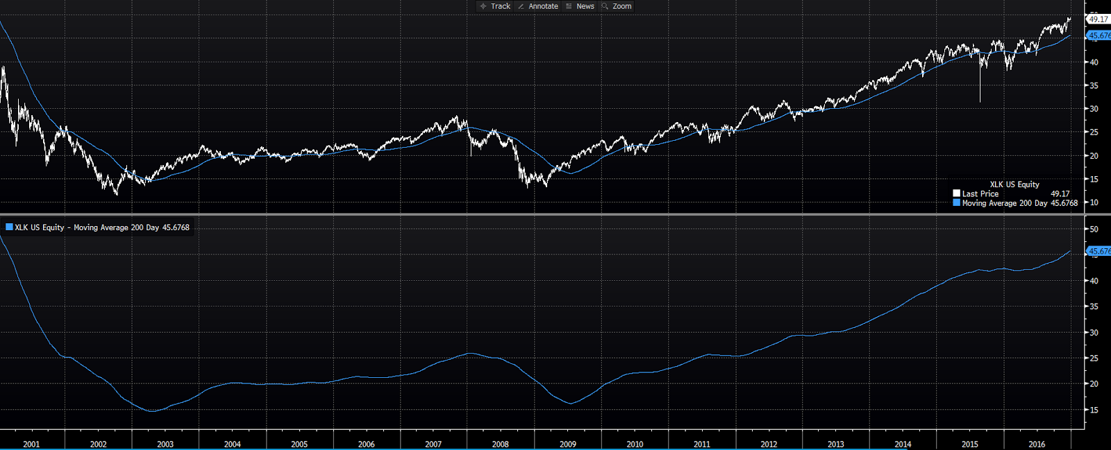
Here it is since:

While tech has seen some selling of late, the long-term trend, for the moment, remains firmly intact.
Here was the industrials sector:

Here it is since:

A continued bullish look for industrials.
Materials then:

Now:

Materials have since broken above their previous high and have continued to trend positively.
Financials then:

Now:

Financials (our heaviest target) appear to have been digesting the post-election surge from last year. The past week has seen them move firmly higher while tech has sold off (read rotation).
Energy then:

Now:

Energy finished last year on a strong note, only to completely fall apart this year. As the technicals deteriorated we reduced our target from 10% to 6% early on. Clearly, global supply dynamics -- as opposed to lack of demand -- has done a number on the sector during a stage in the cycle where typically it'd be a leader. While a very short-term technical view shows signs that a bottoming process may have begun, a longer-term trend analysis paints an uncertain picture (that leans bearish).
Consumer Discretionary then:

Now:

While brick and mortar retail continues to come under pressure at the hands of its online competition, the consumer discretionary sector overall holds its bullish longer-term look.
Telecom Services then:

Now:

We came into the year skeptical on Telecom's prospects, despite the favorable looking chart. And, as you can see, that was a good thing. We're currently maintaining our zero target.
Consumer Staples then:
Now:

We mentioned in our year-end note that the upward trend in staples was suspect based on a flattening of its 200 dma. That flattening has persisted thus far. However, the price has retaken the 200 dma, which has served as support the past few months. While a growthy environment favors our heavier cyclical weightings, we're comfortable with our 8% target for now.
Health Care then:

Now:

We came into 2017 with a cautious 8% target to health care, but -- based on a vastly improving technical picture -- we upped it slightly earlier in the year. Our view of health care as a typically defensive sector -- and one that is distinctly susceptible to political risk these days -- inspires us to keep our target at what we view as a comfortable 10%.
Utilities then:

Now:

We entered the year with a zero target to utilities, and have since -- based on favorable relative performance -- bumped it to 2%. Our assessment of the present economic environment keeps us very cautious on a sector notorious for its interest rate sensitivity.
The bottom line sector by sector: Notwithstanding the energy sector's breakdown, and a tweak here and there, the prevailing technical backdrop remains supportive of our present allocation targets.
As for bonds, while they certainly haven't fallen apart -- in fact they've surprised us with their positive performance to date -- the longer-term trend setup looks ugly to us.
Here's the TLT (tracks the 20-year t-bond) chart from our year-end commentary:

Here it is today:

This week has been particularly ugly. Suggesting that the recent volatility in the stock market is something other than a panicky flight to safety:

As for foreign equities, the long-term trend picture continues to get better.
Foreign Developed Markets (Europe, Australasia, Far East) then:

Now:

Eurozone then:

Now:

Japan then:

Now:

Emerging Markets then:

Now:

As for valuations abroad: Here's the price to earnings table (with year-to-date results) we showed you then.

Here it is now:

The maintaining of those attractive valuations means that earnings have kept pace with price gains.
In closing, the above favorable look aside, we're entering into what is often the most volatile stretch of the year -- following what has been a remarkably low volatility start. While there's evidence to suggest that years that begin with abnormally low volatility tend to finish in similar fashion, we'll refrain from sharing that data. We believe it's smarter to expect the norm, which is substantially more volatility than we've experienced so far this year, and keep our focus on the underlying data and the longer-term trends.
Have a great weekend!
Marty
No comments:
Post a Comment