
And, yes, as we've reported, recent purchasing managers' surveys indicate that the prices of the majority of stuffs used at the producer level are on the rise. We're also beginning to see signs in the debt market via what we call the TIPS spread; which is the difference between the yield of an ordinary treasury bond and that of a Treasury Inflation Protected Security of the same duration. That difference is viewed on behalf of regular treasury bond holders as "inflation compensation".
Here's a 3-month chart of the 3, 5 and 10-year spreads:
click to enlarge

While there's been a dip on the longer-end the past couple of days, and we're certainly not talking thin-air altitudes, the recent trend is indeed higher.
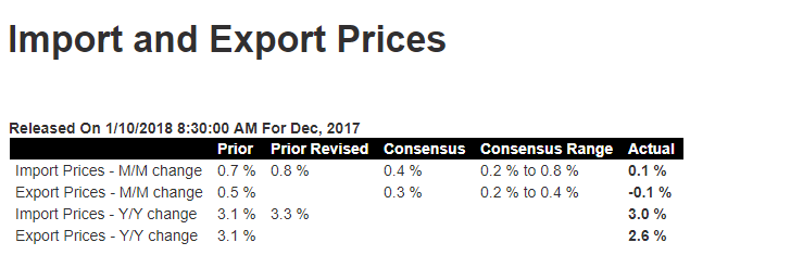
But here's the thing, inflation hasn't been showing up to any great degree in the headline numbers. Case in point would be yesterday's import and export price data coming in below expectations:
And, despite what we said above about producer-level commentary, today's Producer Price Index surprised on the low-end as well:

So, what's going on out there? Are the experts somehow not capturing true productivity levels, which is why they're consistently missing their estimates? Could be. I've actually argued in that vein right around Christmas time -- as I got my gift shopping done on Amazon in less than 5 minutes from my office desk -- for the past several years. But, that said, we at PWA are still in the it's-just-a-matter-of-time camp. Which, by the way, seems to be where -- save maybe for gold traders -- other market participants are camping as well.
Here's a year-to-date look at our daily asset class/sector graph.
click to enlarge

The sectors we're entirely avoiding (our only zero targets) at the moment are the ones that are traditionally the most interest rate sensitive. They would be utilities (-4.04% ytd), REITS (-4.61% ytd) and bonds (particularly beyond the very shortest maturities [-2.01% ytd]) -- the red X's on the top and bottom panels.
As suggested above, Gold (orange line in panel 2) is holding its own (+1.85% ytd), despite the positive macro backdrop.
While we're on the subject, the green X's are next to each sector where we presently maintain a double-digit target (+3.79% to +5.06% ytd).
So, clearly, the financial markets are anticipating a higher inflation/interest rate regime to come, which, again, makes sense to us.
And while a higher rate environment suggests that we should anticipate a higher level of equity market volatility going forward, we shouldn't at this juncture view it as a bad thing, as it'll simply confirm the positives we're seeing in the data.
No comments:
Post a Comment